
At Tufts, students print using a system called JumboPrint. Printers are located around campus, but there is no map to visualize where the printers are. There is also no way to check the status of printers.
Imagine you are a Tufts student named Justin. You're late for class, and you need to turn in a printed essay. You run to the printer you always use. The printer is out of paper! It's the only one you know of. How can you quickly find a nearby printer that has paper? Enter PrintHerd.
Type building name to see all printers within that building. View printers in list or map view.
.gif)
View filtered printers in list or map view.
.gif)
Drag details dialog to minimize. Drag again or tap the map to clear dialog.
.gif)
Printer status updates immediately in details dialog.
.gif)
Swipe to delete, or tap 'Edit' to activate delete mode.
.gif)
The most direct competitor to our product is the existing Tuftswebsite about JumboPrint. Like our proposed product, the Tufts website has the locations of every JumboPrint printer on campus. The website also lists printing costs and has information about how to use JumboPrint on various devices.

The TuftsEcoMap displays recycling locations and other sustainability and transportation landmarks. It is integrated into Google Maps and therefore has detailed location information. However, the EcoMap does not show locations of JumboPrint printers.

Before prototyping, we outlined key characteristics of our users:
We defined several main functions that we wanted our app to include:
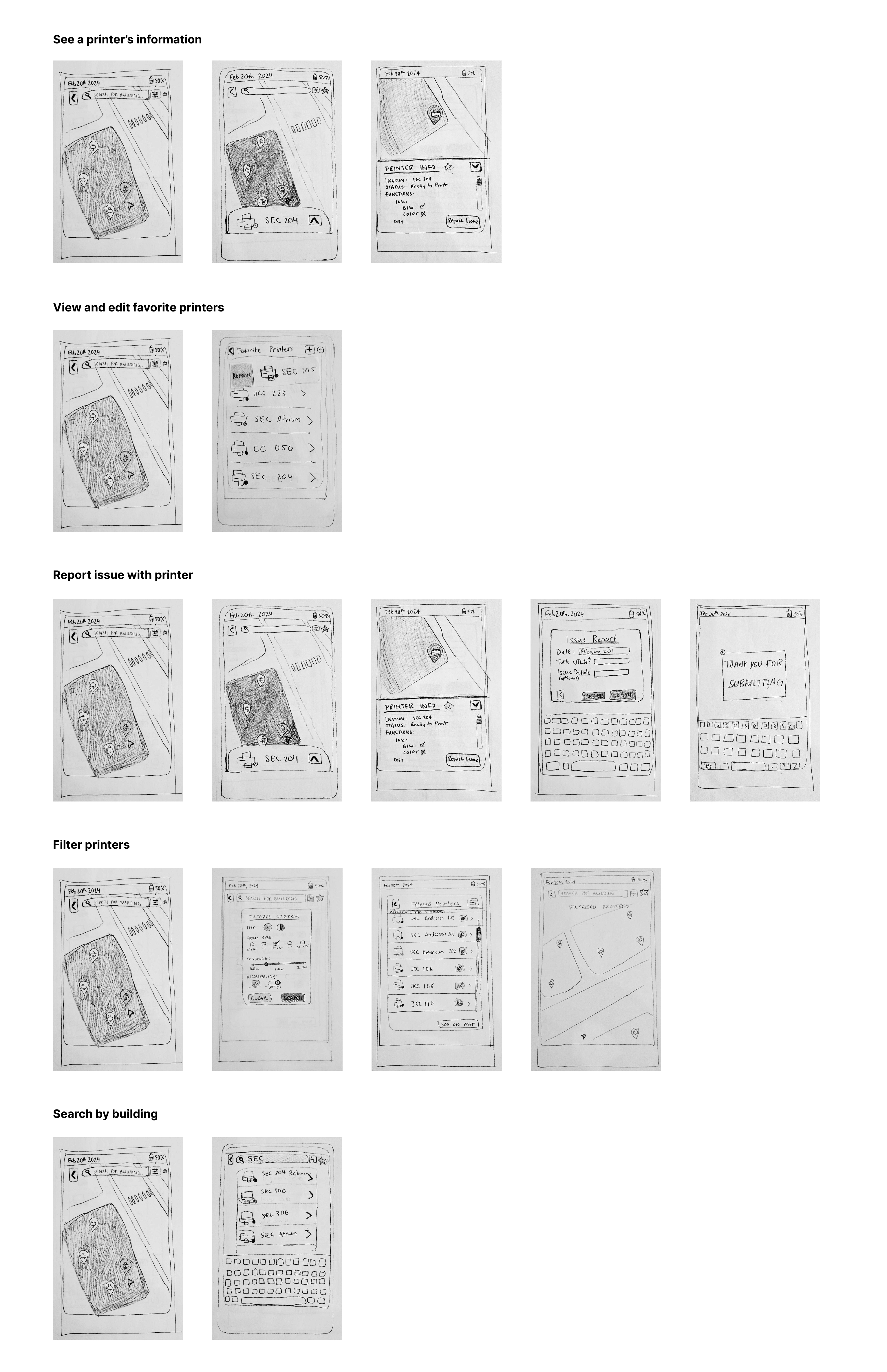
We began our prototyping process with paper prototypes. Then, we moved into medium and high fidelity Figma frames.
I took the lead on our Figma file, bringing our paper prototype screens to life. I created several components and custom vector icons. These selection components were used in our filtered search screen.


For each usability test, we asked the participant to complete several tasks and "think out loud" while they used our app. The tasks targeted the five main functions of our app. Then, we asked each participant to fill out a brief survey about their experience. We summarized some key insights from both the survey and our observations of the users.
📝 SURVEY Key Insights
🔍 Observations Key Insights
After usability testing, we got to work revising our prototype.
We have three main screens involved in showing a printer's information: home, minimized info, and info. Here are the three screens before and after our revision:

Initially, the printer info dialog could only be minimized by dragging down. The minimized dialog could only be cleared by clicking the "X" button. This created a complicated flow for returning to the main map from the printer info screen. We took feedback from our usability tests and created a more efficient and intuitive way to navigate these three pages. Our revised design allows users to either drag the printer info dialog or tap on the map outside the dialog to return to the main map.

One challenge brought up from our usability tests was how to communicate that a printer is out of order, or, more broadly, how to communicate each printer's status without creating too much visual noise. We tried several different printer pin designs before settling on the one in the bottom left.

Initially, our filter icon resembled a funnel. However, users revealed that they did not associate the funnel with filtering and would expect to see something like sliders or toggles. Therefore, we updated our filter icon to fit what our users expected.
Before our revision, 4 of 5 users said they would use our system if they needed to print something. 4 of 5 users also said our system was "easy to use."
