


We surveyed existing articles about methods for stress relief, such as breathing exercises. We found that there are many breathing exercises that are beneficial to mental health.
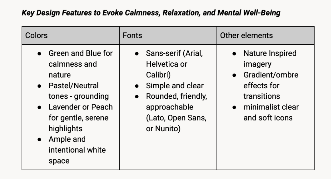
To inspire the look of our interface, we pulled out recurring features from existing mental health apps such as Calm and Headspace. We also asked ChatGPT which colors, fonts, and other design elements would help evoke calmness, relaxation, and mental well being. This research helped us develop ourStyle Guide.


We administered an anonymous survey that gathered basic information about Tufts students’ stress and anxiety. We asked students to identify categories of stressors and things that make them anxious. We also asked them to identify categories of activities they do to relieve stress and anxiety. We received 29 responses and found that students were most stressed and anxious about things related to school, career/job, and social/friendships/relationships. The top categories of methods of stress/anxiety relief were watching TV/movie/YouTube, talking/hanging out with friends, and resting/relaxing/sleeping.
We also interviewed 8 students to obtain more qualitative data. We used ChatGPT to generate interview prompts that were relevant to our product. An example of a question we asked is "Do you prefer installations that are interactive, such as ones that encourage participation, or those that provide a tranquil and quiet environment for relaxation?"
Using the data from our surveys and interviews, we created six user personae to represent our target users, Tufts students. One of our personae is shown below.

After reviewing our data collected from 30+ students, we defined our problem:
We broke down our problem by developing a list of needs that our users have. We then translated these needs into product requirements that we aimed to satisfy.

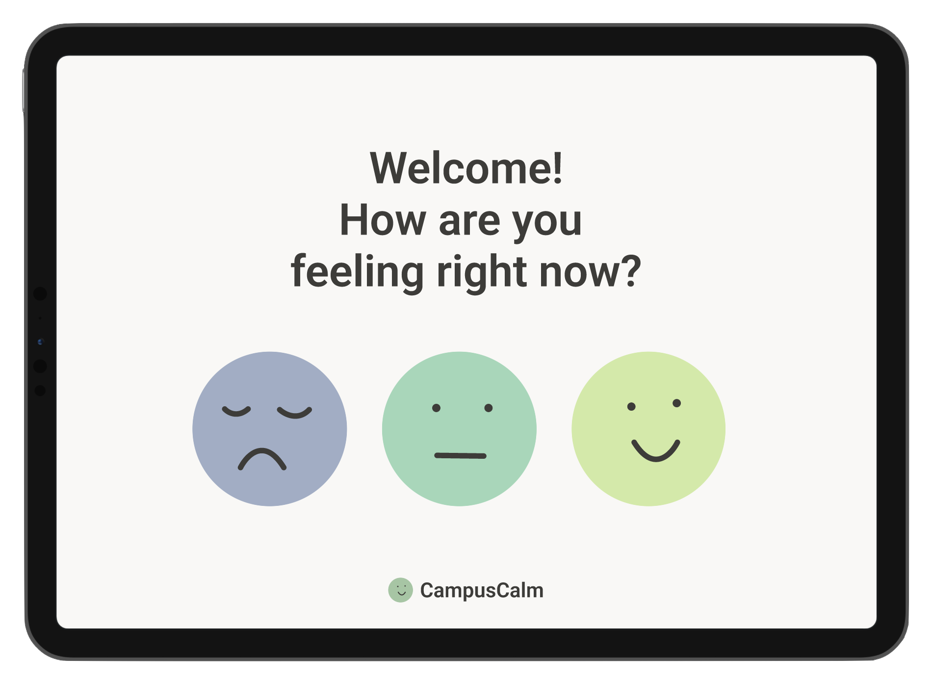
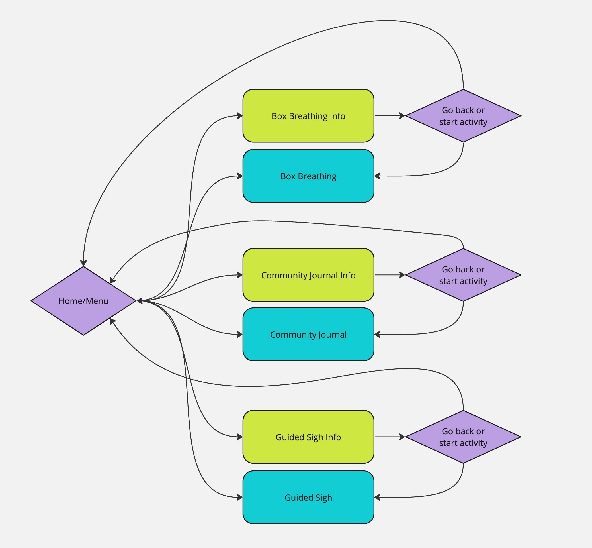
We created a user flow diagram, with "Home/Menu" as our starting page, to visualize how the user could move through our application.
To develop our app's style, we used our findings from market research, as well as generative AI (ChatGPT) to identify key design features for evoking calmness, relaxation, and mental well-being. For example, our style is inspired by exissting mental health apps likeDailyBean.


Once we had decided on green as a main accent color, we experimented with different shades and values of green and gray/tan before settling on our core colors.


Then, we built a prototype for our app in several steps. The bulk of my work in Figma was creating the animations for Box Breathing and Guided Sigh. I achieved the animations by creating components, each variant being a different frame of the animation. I then added interactions between each variant to create an animation. Some animation was also added using interactions between pages. Here's an overview of our prototyping steps:
Created frames to represent welcome survey, exit survey, home screen, each activity's intro page, and then several pages for each activity
Created components for Box Breathing and Guided Sigh
Added interactions between component variants to create animations
Placed each component on the corresponding activity page(s)
Added interactions between pages for navigation and additional animation
We had three Tufts students try our prototype, and here are our three takeaways from usability testing.
Users tried to click to advance through the intro screens, especially for Box Breathing
Make the intro screens load faster, or provide a skip/fast forward button
Users were unable to find the comments button and needed guidance from the researchers
Make it more clear where to find the comments button in the journal activity
Users did not know when each activity ended
Make each activity have a clear ending; ex. a button or page that says “done”
We implemented the changes determined from our usability testing, resulting in the final prototype.
The full interactive CampusCalm prototype can be foundhere. Below are short video clips of the Box Breathing and Guided Sigh activities that I designed and prototyped.


